The concept of the CD design began in Cleveland. The eyes were photographed in the studio with only north light coming in from the windows, and a macro lens was used. I wanted the lighting flat in order to add or subtract in Photoshop any possible venues for changes ahead.

This is where the conceptual design ends, and I was given unlimited creative control over the project. Being the graphic designer and photographer gave me the opportunity to create at will.
Living in and working in Phoenix also helped in creating the images I needed with an abundance of possibilities like roads, blue skies, and mountains. The first thing was to find a car mirror capable of bringing all the attention to her eyes. I located a car show in Scottsdale that people were able to attend every week. Modern autos mostly have their mirrors attached close to the windshield. I needed a stem so the mirror did not look like it was floating. I found this in the older cars like a 57 Chevy convertible. Here I used a 16mm lens and focused on the mirror hand holding it through the driver’s side window. I shot for hours as many different cars, mirrors, and angles as possible. The time of day, that golden hour when the sun is low, was also a factor. This helped me set the tonality for the rest of the images.
The front of the CD incorporates six images I used. After exploring and hiking in Globe, Arizona, I shot the road, which was dirt with a 1000 foot cliff to the right. The road and the lines I needed to draw the viewer into the image was shot in Sedona. The sign was just off some other road. The rest were the car parts.

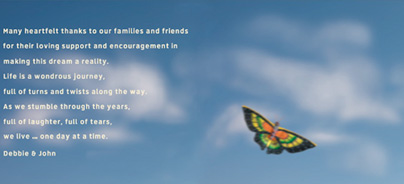
The inner part of the CD was shot over the road near 4 Peaks in Arizona. The clouds were blurred to insinuate the motion of the car. The butterfly is actually a kite that hangs over a ceiling of a back patio. I used the butterfly kite to break up the image when the actual disc was removed.

The CD itself was the cover transformed in Photoshop with the type curved to accent the roundness.

I wanted the back of the CD to be as dramatic as possible. Color and saturation are the punch of any project I work on. I used one of my stock shots of a sunset I shot while coming down from a mountain hike in the Superstitions. The sunset was the only image shot in HDR. The image of the road, again, was shot in Sedona.
Thanks to my wonderful clients, Debbie Gifford and John Trzcinski, for giving me the creative freedom on this project.
Please visit Debbie Gifford’s website and listen to great jazz!
